Complete visual identity and brand guidelines for Estúdio Nove, the design and architecture junior enterprise at Mackenzie.
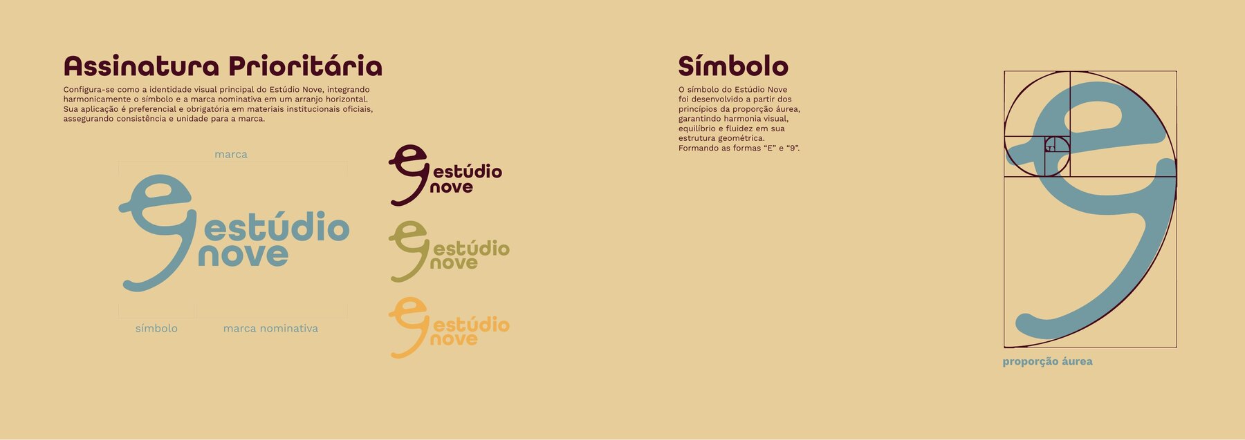
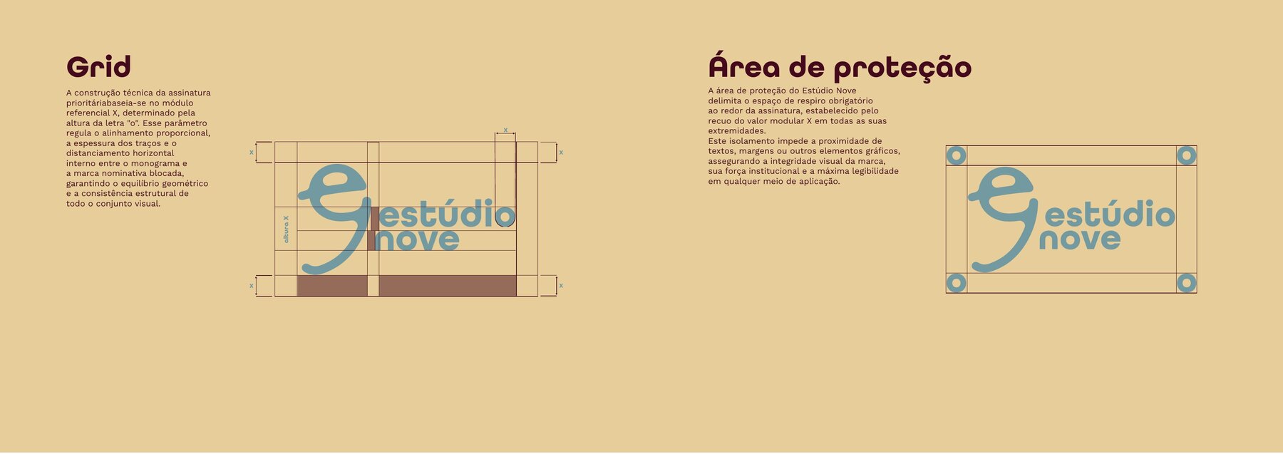
The symbol comes from a single shape that reads two ways: an “e” and a “9”. It is built on the golden ratio, and the primary signature locks the monogram to the wordmark using a module X defined by the height of the letter “o”, the same module that governs the clear space.
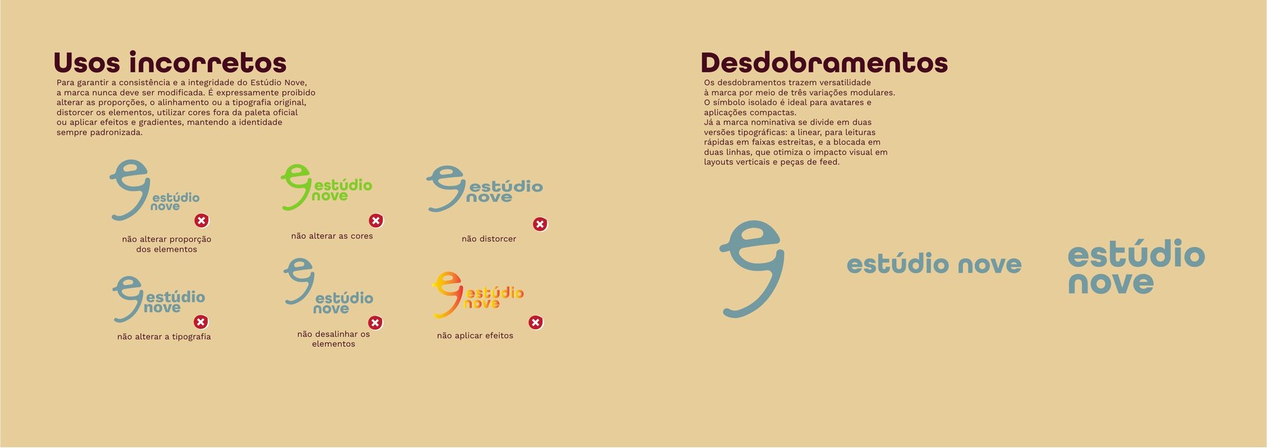
The system unfolds into three variations: the isolated symbol for avatars and compact uses, a linear wordmark for narrow bands, and a stacked two-line version for vertical layouts. The manual closes with a page of incorrect uses, defining what must never be altered.
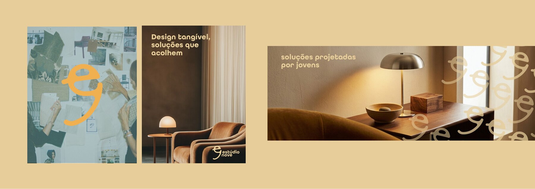
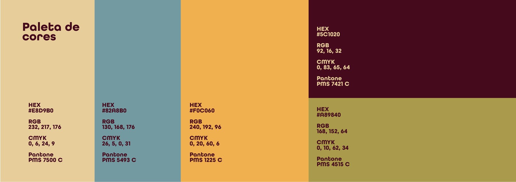
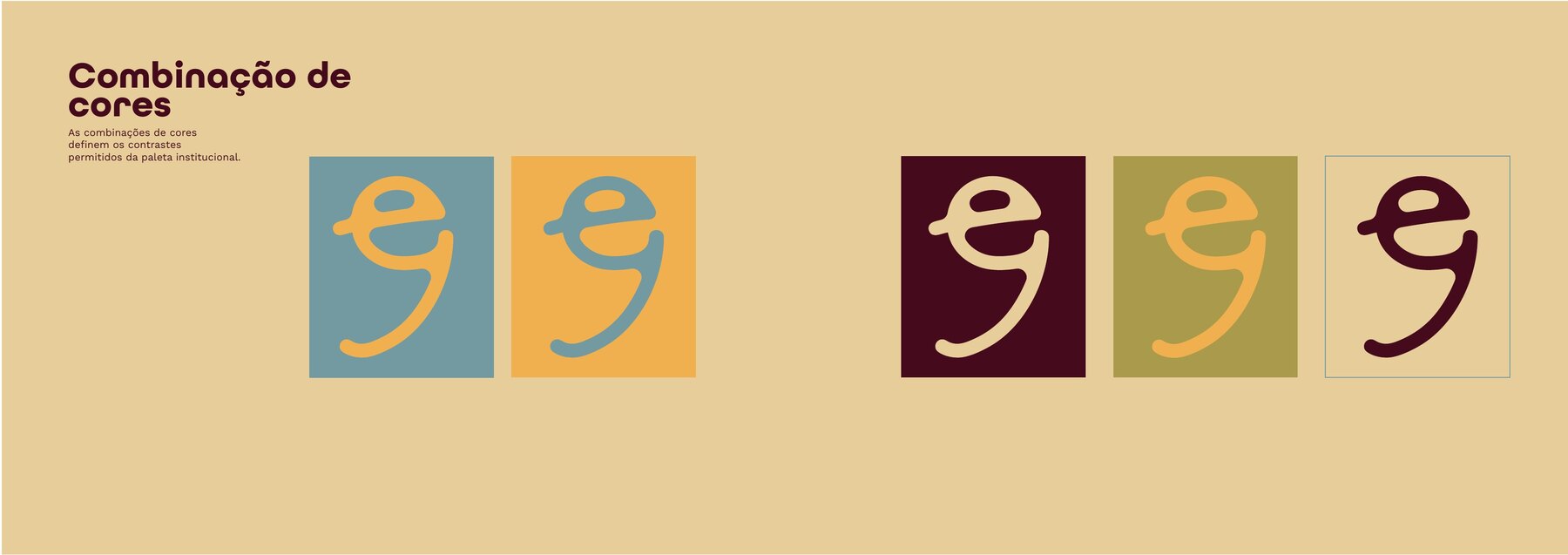
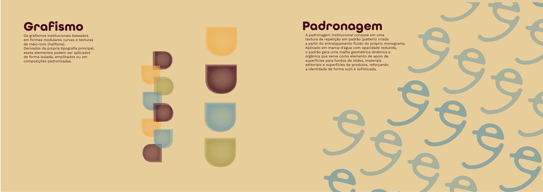
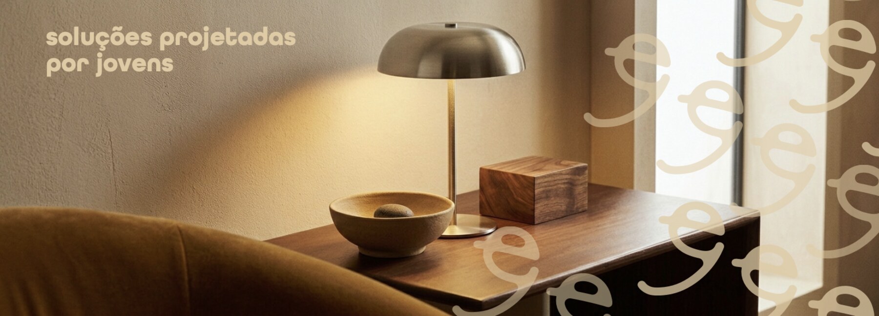
The palette starts from a cream base and opens into blue-grey, yellow, olive and a deep burgundy, with the permitted contrast pairings fixed in the manual. The graphic elements derive from the typography itself: curved modular shapes with halftone texture, stacked or turned into a pattern, the monogram repeated as a watermark, used as a supporting surface.
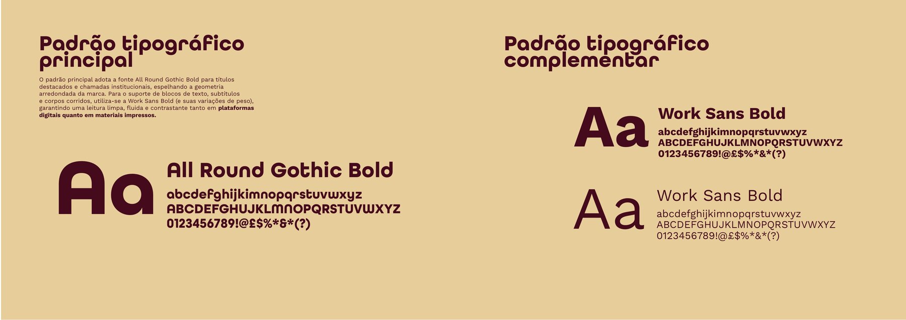
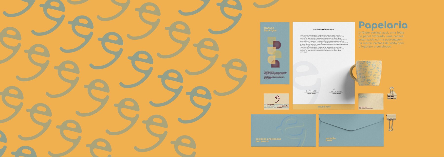
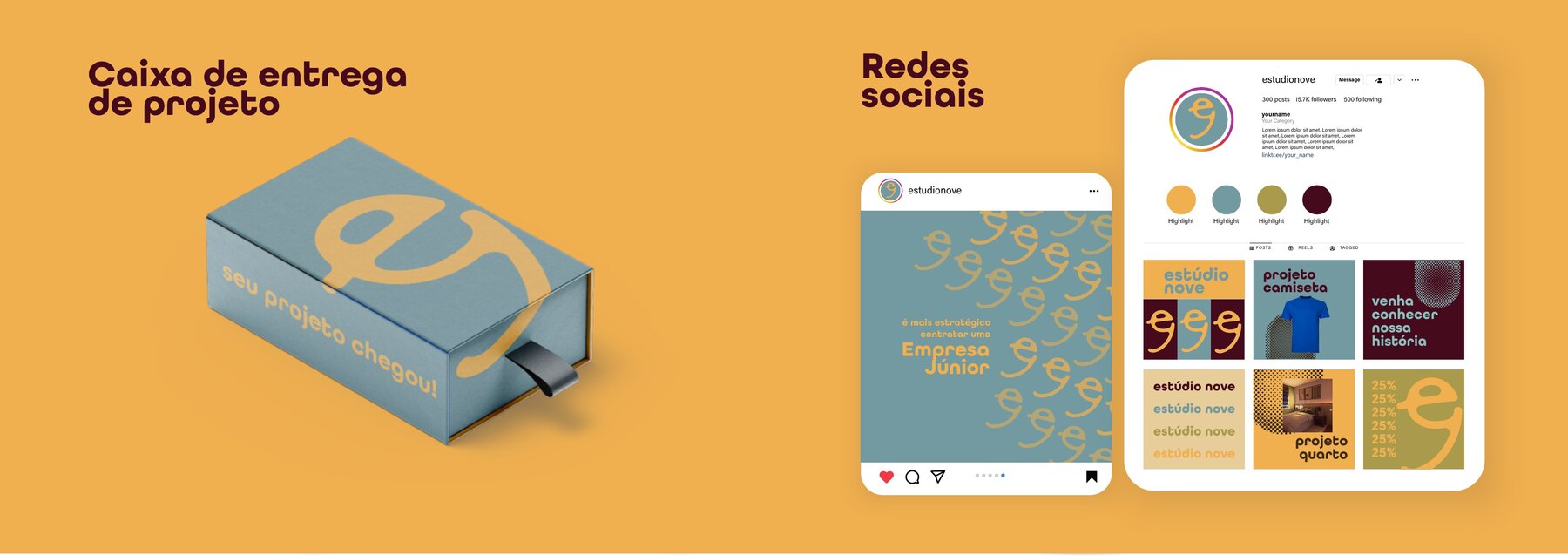
Typography pairs All Round Gothic Bold for headlines, mirroring the rounded geometry of the mark, with Work Sans for body copy. The system was tested in application: stationery, folder, letterhead, cards, envelopes, mug, project delivery box and a social media feed grid.
PDF View the full brand guidelines ↗